Discover Your Color Personality

Studies have shown that the colors you pick for your home isn’t just a matter of aesthetics. They can have a profound effect on the emotional well-being of you and your family. In fact, colors are a form of communication that reflect your personality and set the tone in each room of your home.
According to the Institute for Color Research, people make a subconscious judgment about an environment or product within the first 90 seconds of initial viewing. Between 62% and 90% of that assessment is based on color alone. That’s something pretty powerful and worth considering.
When you are looking at your space, think about how you want to feel when you are in there. Do you want the space to be relaxing and cozy? Or, do you want the space to be more invigorating? Do you want class?
Once you have answered these questions to yourself, the color choice becomes easier. However, keep in mind that the colors you choose should match your personality, be an extension of your style, and should feel like it is truly your space.
You don’t have to worry about trends in order to have a beautiful home. Color trends will come and go. Here is a room-by-room rundown of the colors believed to work best in each of the rooms of your home and the emotional impact they create.
The Color Of Your Room And Why It Matters
Every room in the house makes you feel a certain way. Whether you’re choosing paint colors for your kitchen or picking out stone types for a bathroom, think about how the color will affect your room!
The Colors In Your Bedroom

The bedroom is where we go to relax and recover at the end of a busy day. It is also the room where your mind gears down and finds serenity.
Cool colors – blues, greens, and lavenders – can be great choices, because they are known to have a calming effect on the mind. Moreover, according to color consultants, they have far more personality than any other cool colors. If you put them together, you have a palette that’s full of life, but won’t keep you awake at night.
The darker the hue, the stronger the effect is believed to be. Because these colors are analogous, they can be mix-and-match without fear of clashing or color cacophony. As an additional advantage, cool colors make space look larger and cleaner.
Living Room Colors

The living room is the heart of our homes. It is the space where family and friends gather to spend time together. So, it is very important to create a well-balanced living atmosphere.
Warm tones like reds, yellows, and oranges, along with the earth tones like browns and beiges work well for the living room, because they’re known to stimulate conversation. These colors will also infuse your living room with energy and warmth, two things that are always good to have in your mostly used room, no matter the season.
For a powerful impact, paint a wall one of these shades or go with warm-hued curtains, pillows or upholstery.
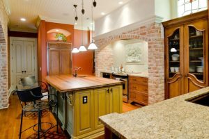
Your Kitchen’s Colors

Designers believe that colors have the power to transform a room, making small rooms feel larger or darker rooms feel brighter. However, colors have a hidden talent – they affect the mood of everyone around them.
Vivid colors like yellow stimulate our intellectual energy and put us in creative mood. This would certainly help during the cooking process. Also, vivid colors will fill you with energy and spark imagination.
Other suitable colors are orange and light blue, which go well with white kitchen cabinets and ceiling.
The Dining Room Color Palette

The dining room is the place where we entertain guests and share family meals. Because of its importance to our home, it’s essential that we pay close attention to the design and colors.
Everything should work well together, from the ceiling lightning to the flooring, to the walls and furniture. However, there is no one perfect dining room, just an endless variety of designs and colors that fit the taste and style of the people they serve.
Contrast colors seem to work well in most dining room designs. Classy blues and reds combine neatly with white ceilings. Reds are known for encouraging conversations and whet the appetites of the guests.
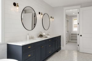
Coloring Your Bathroom

Nowadays, the bathroom is more than just a functional space in our home, it is also used for private relaxation and rejuvenation. For this reason, it is essential to achieve a good balance of form and function, combining aesthetics with functionality.
Whites and warm colors are always a good choice for bathrooms.They are thought to evoke cleanliness and purity. Blues, greens, and turquoises can be other great options as they give a sense of cleanliness, freshness and calmness.
But, whatever color you choose, make sure you stick to your taste and style preferences.